


Best Font for Dyslexia: Top 8 Easiest Fonts to Read for Dyslexia
 Natalie Fitzgerald - 10/04/23 | Last modified: 07/08/26
Dyslexia is a learning disability in reading often characterized by slow reading, reversing letters, and difficulties with reading comprehension. Font style can play a significant role in readability for people with dyslexia. Some fonts can improve reading speed and comprehension, while others impede it and slow readers down. This article will review the characteristics to look for in fonts for dyslexia as well as provide multiple examples of fonts to choose.
Criteria of Fonts for Dyslexia
There are several different characteristics that make some fonts more readable than others for people with dyslexia. Using a more dyslexia-friendly font will help increase reading accessibility for people with dyslexia. Some of the best characteristics for dyslexia-friendly fonts are:
Sans Serif
Serifs are the small lines on the ends of letters in certain fonts. Fonts such as Times New Roman and Georgia are Serif fonts. However, Serif fonts are known to be more difficult to read if you are dyslexic. Instead, fonts that are Sans Serif, without the little marks, are a much better choice.

Monospace
Monospace fonts are ones where each letter takes up the same amount of space, causing letters to be more spaced out. True monospace fonts can be difficult to find, but fonts that give more space per letter can be easier to read for people with dyslexia.

Non-italic, non-oblique
Italic and oblique (even more slanted than italic) fonts have been shown across multiple studies to slow reading time for people with dyslexia. Instead, keeping font in the normal style is very helpful for improving reading time.

Minimum 12-point font
Keeping font at a minimum size of 12 pt is best for readers with dyslexia. Some studies suggest the optimal font size should be between 12 and 14 pt, though this may vary across individuals.

Aligned left, not justified
Left aligned font is thought to be the easiest for people with dyslexia to read. This helps to visually cue readers as to where lines start and stop. When text is justified, instead of left aligned, it makes the spacing less consistent and can be more difficult to read for some people with dyslexia.

Color
Dark text on light backgrounds seems to be the best for people with dyslexia. The default of black text on a white background keeps the contrast high and makes letters and words easier to read. If you want to use more than just black and white, dark blue or gray texts on other light colors is also acceptable. It is generally recommended to avoid light text on dark backgrounds, or colors that are too similar such as dark blue on light blue, but this can vary by individual.


Top Dyslexia Friendly Fonts
There are several standard fonts that are friendly for people with dyslexia. Most of the dyslexia friendly fonts listed below are sans serif, though there is one serif font included.
Arial
Arial is thought by most to be the best font for dyslexia among the standard fonts. Its readability for people with dyslexia has been the subject of several research studies. The main downside to Arial font is its lack of monospacing. Additionally, it can be very difficult to read when used in italics.

Comic Sans
Comic Sans is the font everyone loves to hate. However, its unique character shaping makes it an ideal font for dyslexia. It has the benefit of every character looking unique, with the exception of lowercase “d” and “b”.

Century Gothic
Century Gothic is another good example of a sans serif font that has increased space between letters and most letters are easy to distinguish from each other. It has the downside of some letters being more tightly spaced than others.

Calibri
Calibri is a sans serif font that also uses wider letter spacing. Calibri was made for on-screen reading, and it is the default font setting on Microsoft Word. Calibri’s wide spacing makes it another good font for dyslexia.

Verdana
Veranda is another option if you are looking for a sans serif font that is largely considered easy to read. It was designed for both on and off screen readability and is considered by many to be a good font for dyslexia. However, Veranda is not monospaced.

Helvetica
Helvetia is a final sans serif, standard font that is easier to read for people with dyslexia. Hevetica was created way back in 1957, and as a font has stood the test of time. Helvetica is also not monospaced, but uses wider letter spacing to increase its readability.

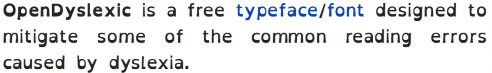
OpenDyslexic
OpenDyslexic is a font made specifically for people with dyslexia. OpenDyslexic letters have heavier bottoms and adjusted shapes so that no two letters are shaped exactly alike.
Courier
Courier is the only serif font on this list, however, it is monospaced making it easier to read than most other serif fonts. Because of this, Courier is a good choice for when a serif font is needed. In fact, it has been shown in studies to improve readability for dyslexic people similar to sans serif fonts like Arial or Veranda.

What to Avoid in a Dyslexic Font
There are several considerations when choosing a font for dyslexia. Similar to knowing what you should look for, you also need to be aware of what to avoid. Characteristics to avoid when choosing a dyslexia friendly font include:
- Italics. Using italics can make letters harder to identify. Studies have shown italic fonts to be the hardest for people with dyslexia to read.
- Serif fonts. It is generally recommended to avoid serif fonts (fonts with tails at the ends of letters) because they reduce readability for individuals with dyslexia bby making it harder to read individual letters.
- Small font. Smaller fonts, those smaller than 12 point, are typically harder for dyslexic people to read because distinguishing letters can be more difficult. Similarly, very large font can decrease readability as well.
- Proportional or variable width fonts. These are fonts where letters take up varying amounts of horizontal space, so letters such as “I” or “f” make up less space than “m” or “w”, which makes the font more difficult to read.
- Tight character spacing. Tight character spacing simply means fonts where all characters are very close together. It is slightly different from variable width, because not all variable width fonts also have tight character spacing. Examples of this would be fonts like Impact.
Using Forbrain to Help with Dyslexia
Forbrain is an auditory feedback device, worn as a headset, that uses bone conduction to help individuals hear their own voice up to 10x faster. Forbrain can be helpful for improving reading comprehension in people with dyslexia. By wearing the headset and reading aloud, individuals will hear the words they say back to themselves at an increased speed, which can help reduce errors and improve reading comprehension. To learn more about how Forbrain can help children with dyslexia, please see this page.
FAQs about Best Fonts for Dyslexia
Do certain fonts help dyslexia?
Yes, certain fonts do help for dyslexia. Fonts that are sans serif, monospaces, 12-14 point, and non-italic are best for improving readability for people with dyslexia. These can include fonts such as Arial, Century Gothic, or Comic Sans among standard fonts.
What font is not good for dyslexia?
Any font that is a serif font is typically considered worse for readers with dyslexia. Also, fonts that are in italics, are too small, or have variable-width can be more difficult to read.
What is the hardest font for dyslexia?
Fonts in italics are generally considered the worst for people with dyslexia. Also, fonts with irregular spacing, shapes, or curves are harder for dyslexic people to read. Some fonts included in this are Brush Script, Papyrus, Broadway, Chiller, and Ecofont.
Why use dyslexic font?
As many as 15-20% of the population may be dyslexic. Improving readability for people with dyslexia will greatly improve your readability for a significant portion of the population.
Why is typing better for dyslexia?
No matter which font you choose, typed words are always more consistent than written words.
Can you be dyslexic but read ok?
Yes! Many people with dyslexia can become fluent readers with practice, strategies, and instruction.
Final Words
Dyslexia is a common learning disability affecting up to 15-20% of the population. It causes difficulty with reading speed and comprehension. There are many different font types that can make reading easier for people with dyslexia, such as sans serif, monospacing, and non-italic fonts. There are some fonts made specifically for dyslexia, but many standard fonts, such as Arial, are highly recommended as well. Improving readability for people with dyslexia can help a large number of people better access written information.
References
10 best fonts for dyslexia. AudioEye. (2023, January 19). https://www.audioeye.com/post/10-best-fonts-for-dyslexia/
British Dyslexia Association. (n.d.). Dyslexia friendly style guide.
Cowen, C. (2017, December 4). How widespread is dyslexia?. International Dyslexia Association. https://dyslexiaida.org/how-widespread-is-dyslexia/
Rello, L., & Baeza-Yates, R. (2013). Good fonts for dyslexia. Proceedings of the 15th International ACM SIGACCESS Conference on Computers and Accessibility. https://doi.org/10.1145/2513383.2513447
Staake, J. (2022, June 29). Best fonts for dyslexia and why they work. We Are Teachers. https://www.weareteachers.com/best-fonts-for-dyslexia/